Hello folks! 👋
As discussed last month, the redesigned chatting experience has been well underway for quite awhile. And now, we’re beginning to roll this out to a variety of chatrooms — so far, over one hundred active chats have had the design manually applied, with a broader rollout expected soon.
I wanted to go over some of the core changes to the chat in this blog post, so you’ll know what to expect when your chat receives the update, if it hasn’t already. Let’s dive in.
All-new mobile experience
The mobile view of the chat, which is also used when the chat is embedded in a small view, has received the most focus and attention.
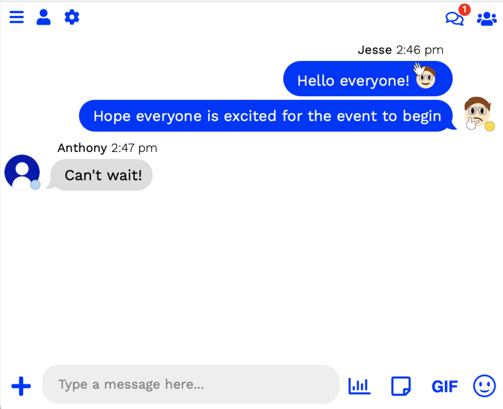
The new layout is far more familiar for users. The icons on the top right represent your direct messages and user list — and they hide out of view if those features are disabled in your chat.
Additionally, if you have Channels enabled, they will show up at the top, too:
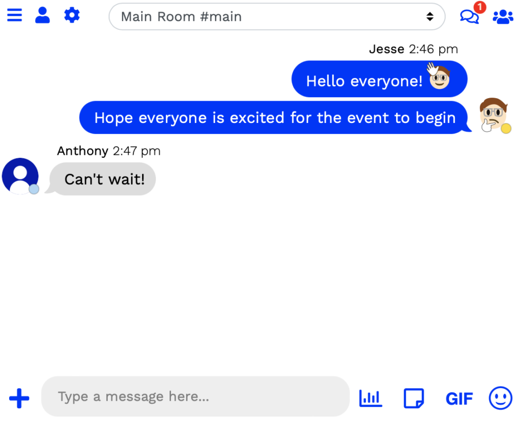
This makes it easy for users to switch channels. Additionally, channels that require a specific rank — such as channels for moderators and up — will only show up if the user has access. This way, you can set up a VIP channel for Regulars and up, without your Visitors feeling sad that they’re excluded.
Additionally, the other menus with mobile have been changed, as well. If you click to view your Direct Messages at the top, you’ll see this screen:
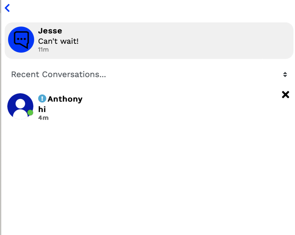
The arrow at the top of the page will take you directly to the main chat again, to reduce the likelihood of users getting confused or stuck when navigating to Direct Messages on mobile.
Finally, when navigating between menus, the mobile chat will display a slide-over animation:
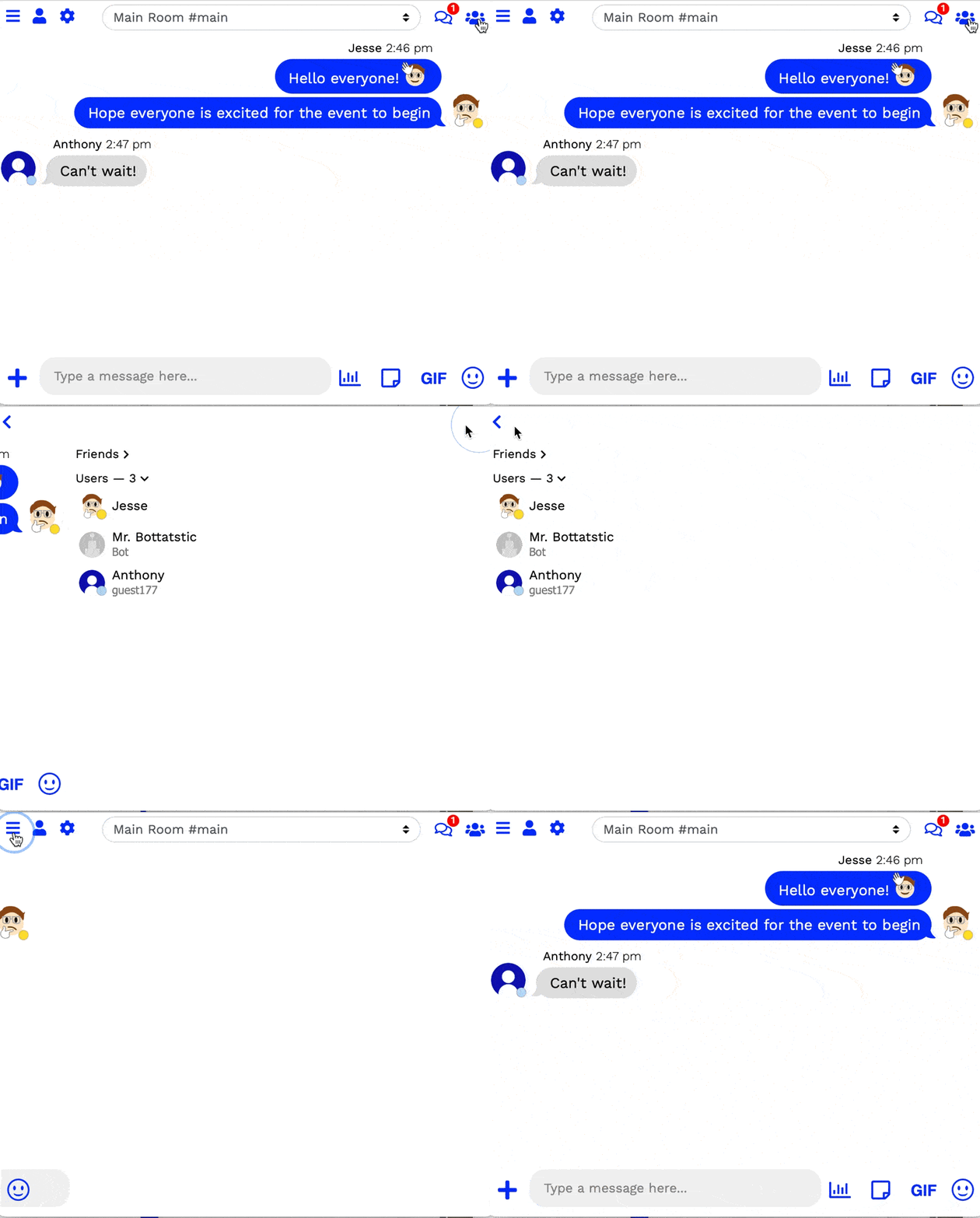
To help with accessibility, Minnit honors the user’s “Reduce Animation” request in their browser or operating system settings. This way, if a user is prone to motion sickness or dizziness when rapid animations play, the chat will not play these animations; instead, tapping the icon will take you straight to the relevant menu, with no animation.
Message Changes
Another important component of chatrooms is, of course, the messages themselves! So when designing the new chat, extra care was put in to make sure that messages looked modern and familiar to your users.
Chat owners still have the ability to change the message bubble color, or disable message bubbles entirely. When enabled, names appear at the top of a series of messages, with the user’s photo at the end. Messages sent by the user appear on the right, whilst incoming messages appear on the left.

However, if message bubbles are disabled, the chat behaves quite a bit differently:

Profile pictures remain at the top of a series of messages, beside the user’s name. Subsequent messages appear below it, without re-rendering any names or pictures.
Additionally, the front for messages has been changed from Varela Round to Work Sans, to look more like other messaging platforms, services, and applications.
Subsequent messages will not re-draw profile pictures or names unless the following have occurred:
- More than seven minutes have passed since the last message
- One of the messages contains a poll (in which case, the next message will re-draw the nickname and photo)
- 9 or more messages have been sent in a row
- One of the messages in a row has been deleted — this will only re-draw it for moderators and above, normal users will not see an immediate change, to avoid making it obvious something was removed
Other changes
A lot of our chat HTML & CSS has been changed over the past few months to get ready for this change. The textbox, and accompanying icons, have been completely revamped, as well as a ton of other chat features, menus, and buttons — far too many little details to list here.
Some of the important ones that are worth mentioning are:
- The chat radio has it own dedicated button in the top bar, if a radio is enabled, to make it easy for users to tune in.
- Stickers, if enabled, also get their own dedicated button.
- Your chat accent color now changes the color of more chat elements, making it easier to customize the chat and make it match your website or blog.
- The User List now shows the number of users connected, so you can easily see how active your chatroom is.
- If a user has nobody added as a friend, the “Friends” toggle no longer appears, to conserve space.
- You are now able to view older Direct Message conversation that you’ve already read — this makes it easier to follow up on previous conversations you’ve had.
- When visiting the chat directly on a mobile device (not embedded), the chat will do a better job at taking up all available screen real estate.
- And so much more…
We will continue to roll these changes out to all chats over the coming days and weeks. If you have custom CSS on your chat, this update will take extra time for you to receive, to ensure none of your changes break during this process — chats with custom CSS will not receive this update until they have been manually reviewed by Minnit Staff.
Stay tuned to our social media for more updates — Minnit is on Twitter, Facebook, and now, Threads! Be sure to follow us on all platforms to ensure you don’t miss a thing. 👍
And until next time… Happy chatting!
Jesse
